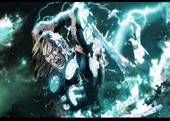
1st one: watch your depth. It looks over sharpened and over blurred. You need it somewhere in the middle. Actually pretty cool!
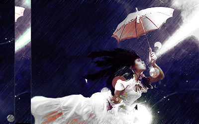
2nd one: Great concept, but that clipping mask on the left doesn't fit the flow and it distracts. It's flowing from bottom left to top right so make clips that accent or boost that flow. The bg is too dark to see any details.She pretty much looks floating and flat without it.The lighting looks great! Keep at it
I need to put that clipping mask on the left because that side is empty. hahaha.. just to add some element into it. LOL.


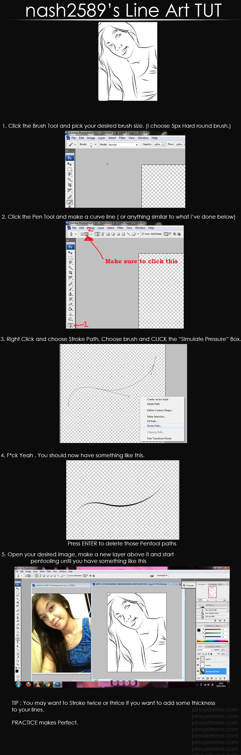
Recently made Sigs
in Graphics ShowRoom
Posted · Report reply
I need to put that clipping mask on the left because that side is empty. hahaha.. just to add some element into it. LOL.
Thanks for the feedbacks.